|
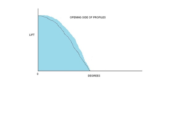
You hear the term “area under the lift curve“ used a lot in cam profile designs. Above is a very simple chart to help visualize what is meant by the area under the lift curve. I created a very basic chart with a drawing program. It does not represent any known cam profiles and is not to any scale or resolution. Its only purpose is a visual aid.
Remember the lift table from previous posts? It shows the profile lift for each degree of rotation with zero-degrees being the maximum lift. If you convert the lift table into a graph form, you have the lift curve. The horizontal line is the number of degrees in the profile and the vertical line is the profile lift. The chart only shows the opening side of the profiles. There are two cam profiles represented in the chart; both have the same lift and the same seat-to-seat durations. The blue is the area under the lift curve. Simple enough, right? There is obviously less blue area under the black line than there is under the blue line. Once the valve starts to open, there is more duration for the same lift on the blue profile. Instead of the seat-to-seat durations being the same, the two profiles could have the same duration at .050 or any other tappet height. This is a very meaningful way to compare cam profiles and to see the advantage of having more area under the lift curve.
0 Comments
Leave a Reply. |
Archives
July 2024
|
